Did you put enough thoughts into how your E-commerce Websites home page is designed?
In 13 years and working over more than 3000+ website (variety of geos and sectors) one thing noticed very commonly is client designing website for themselves.
We have to persuade the client to have an outlook of the visitors of the website and at times it becomes hard for us to convince the client about what we have learned in last 13 years.
Ultimately we built our own analysis tools that helps us show the concrete data of what we mean by ‘Design for your customers.’
Especially for E-commerce Website we always recommend to build your home page that would help your visitors to take actions immediately.
So here are the little secret tips that would help you boost you sales, typically suited for E-commerce Website, but would work for other websites too.
#1 Design Long (Deep) E-commerce Home pages
Many of us think that long homepages (or any pages) are not a good idea, but many research say that longer the sales letter better the chances of conversions.
While designing webpages we always recommend clients to keep it long, after all your webpages are your sales letters.
#2 The Famous Inverted Pyramid
While long pages is a good idea, but without the famous inverted pyramid rule long home pages will not show the results.
The inverted pyramid rule states that keep the most attractive (lucrative, actionable, highlights) on the top fold of the site.
Welcome the visitor with your best products, best discounts, best information. Just below the fold add some important details and then lower down the page keep other information.
For eCommerce website, keep the discount coupons, codes, offers above the fold. A simple free shipping word has huge impact on the consumers.
#3 Inpage navigation
If long pages is what brings more conversion, in page navigation like (Go to top) buttons makes it easier for visitors to stop worrying about scrolling up and encourages exploring more deeper.
While mobile visitors will also find this feature very handy.
#3 Main Navigation Trick E-commerce
With longer pages, the main navigation gets lost as the visitor starts to explore the page below the fold, a better idea is to make the Main navigation sticky at top and thinner so it makes its presence with minimum screen space.
A search bar within the sticky menu will make it easier for visitors to search products right from the location where they are on the screen.
The basic concept is to make it as easier for visitor to located the more lucrative information that will lead to a sale or conversion.
The other things that a visitor fears are
- Longer registration E-commerce Website forms
- To many long paragraphs (Make smaller paragraphs)
- Absence of images
- Slow loading pages
- Unreadable font
- Popups shown too early
- Deep level navigation menus (2 Levels are good)
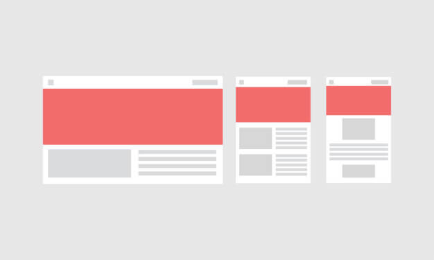
- Non mobile friendly pages.
On parallel note you should read this too

